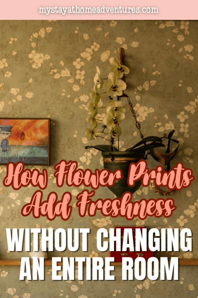
How Flower Prints Add Freshness Without Changing an Entire Room
This post may contain affiliate links which might earn us money. Please read my Disclosure and Privacy policies here
Redecorating a room is often treated as a larger undertaking than it needs to be. New furniture, fresh paint, upgraded lighting and replacement textiles can certainly transform a space, but they also require time, money and a willingness to live with disruption.
In many homes, the more practical challenge is not determining how to redesign everything, but how to make an established room feel different without dismantling what already works.
Flower prints offer one of the simplest answers because they can change the visual tone of a space without interfering with its basic architecture or function.
They introduce color, movement and natural imagery while leaving larger investments, such as sofas, dining tables and cabinetry, untouched. The result can feel surprisingly substantial even though the physical change is limited to the wall.
Why Floral Imagery Can Change the Mood of a Room
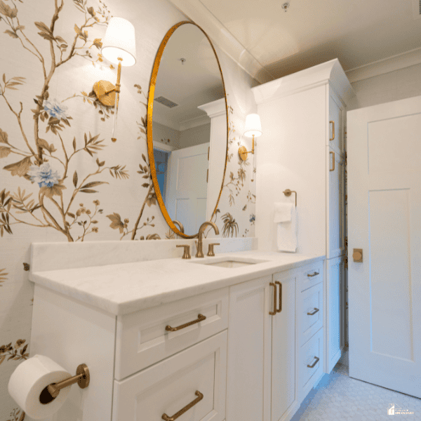
Flower imagery has an unusually direct relationship with how people interpret an interior. A room dominated by straight furniture lines, neutral fabrics and hard architectural surfaces can begin to feel softer once organic shapes appear on the walls.
Petals, stems and leaves create curves that contrast naturally with rectangular tables, window frames and shelving. That contrast gives the eye a new place to settle and can make a room appear less rigid without requiring any structural change.
Floral artwork also brings associations with gardens, seasons and outdoor spaces, which can make an interior feel more open and relaxed. Even a restrained botanical composition can therefore alter the emotional character of a room more than its modest footprint might suggest.
The effect does not depend on filling a wall with bright blossoms or turning a room into a botanical theme. A single print showing oversized petals in muted colors can make a minimalist living room feel warmer, while a detailed vintage botanical study can give a traditional office additional depth.
Contemporary floral photography may work particularly well in rooms with clean furniture because the organic subject offsets the precision of modern design. Abstract flower imagery can perform a similar role without making the subject matter feel literal.
The important consideration is the relationship between the artwork and the atmosphere already present in the room. When those elements complement rather than compete with one another, the print functions as a visual adjustment rather than a decorative overhaul.
This ability to affect perception with relatively little physical intervention explains why wall art is often useful in rooms that are already largely finished. Homeowners may like their furniture arrangement and color palette but still feel that something is missing.
In those cases, the problem is often visual energy rather than functionality. Floral prints can supply that energy because they introduce recognizable forms while offering an enormous range of styles, scales and colors.
They can make an understated room feel more expressive or calm a space that contains many severe geometric forms. Because artwork is easy to reposition, the change also carries less commitment than repainting a wall or replacing a large piece of furniture.
Using Flower Prints as a Low-Commitment Design Update
One of the advantages of floral artwork is that it allows a room to evolve gradually. Interior tastes change, but sofas, dining sets and storage pieces are usually expected to remain in a home for years.
Wall art occupies a more flexible position because it can be moved, regrouped or replaced without affecting the basic usefulness of the space. That flexibility makes flower prints particularly suited to homeowners who want a seasonal or stylistic refresh but do not want to commit to a larger decorating project.
A print can introduce a new accent color that is later repeated in a cushion, vase or throw, allowing changes to develop in stages. The artwork becomes a starting point rather than an obligation to redo the rest of the room.
The challenge is often not deciding whether to add floral artwork, but finding a piece that feels compatible with what is already in the room. Flower imagery can range from loose watercolor studies and traditional botanical illustrations to dramatic photography and contemporary graphic compositions, giving homeowners considerable flexibility.
A broad assortment also makes it easier to compare styles, colors, scales and presentation materials before committing to a piece. Wall-art marketplaces such as iCanvas offer one example of that variety, with floral and botanical wall art spanning different styles, color palettes and presentation formats.
This range makes it easier to see how the same subject can work in very different interiors, from quiet bedrooms to modern living rooms, without requiring changes to the existing furniture or palette.
The financial equation can also favor artwork when a room needs visual improvement but does not require functional changes. Replacing a large sofa, rug or dining table can quickly become expensive, especially when delivery fees and the disposal of older furnishings are involved.
A carefully chosen print can address a dull wall or weak focal point at a smaller scale and with considerably less disruption. It can also test whether a homeowner actually likes a new color direction before that color is introduced more permanently elsewhere.
If the experiment works, smaller accessories can reinforce the palette later. If it does not, changing the artwork is easier than reversing a major furniture purchase or repainting an entire room.
How Color Creates Freshness Without Repainting
Color is often the first thing people notice when they describe a room as fresh, but walls do not have to carry all of that responsibility. Floral prints can introduce concentrated areas of color that alter the balance of an existing palette.
A beige or gray room, for example, may feel more animated when a print adds greens, coral tones or dusty blues in a controlled area. Because the color is contained within the artwork, it can be more vivid than homeowners might be willing to use across an entire wall.
The surrounding neutral surfaces then act as visual breathing room. This arrangement often makes the new color appear deliberate rather than overwhelming.
Flower prints are particularly effective because flowers naturally contain several related colors within a single composition. A painting of peonies might combine pale pink, deeper rose, cream, green and small areas of brown, providing multiple tones that can connect with different objects in a room.
A botanical photograph might contain dark foliage alongside bright petals, which can help bridge light upholstery and darker wooden furniture. Instead of searching for one perfect accent color, homeowners can use the artwork as a palette containing several compatible options.
That makes later styling decisions easier because cushions, ceramics or table linens can pick up individual colors already present in the print. The room gains greater color complexity without requiring additional permanent finishes.
The freshness created by color also depends on saturation and contrast. Bright yellow flowers against a pale background can make a kitchen or breakfast nook feel more energetic, while white blossoms against deep green foliage may create a calmer but equally noticeable shift.
Muted prints can freshen a room in a quieter fashion by adding tonal variation rather than dramatic contrast. This approach can be useful in bedrooms, studies and reading spaces where visual calm is more desirable than intensity.
Dark floral artwork can also work in light rooms by adding depth and preventing the space from looking washed out. Freshness, in other words, does not always mean brighter color; it often means creating a more intentional relationship among the colors already present.
Scale Matters More Than the Number of Prints
You do not need several pieces of art to refresh a room. Size can have more impact than quantity. For example, one large flower print above a sofa can draw attention more effectively than small accessories placed around the room.
A large print also gives an empty wall a clear focal point. This works well above substantial furniture, where a small print might look out of place. With the right size, one piece can change how the whole room feels.
Small flower prints work well too when you group them with care. Try arranging a set of botanical images in a grid for a tidy, cohesive look.
This works well in hallways, home offices and dining areas where a single oversized piece may be impractical. Repetition can provide cohesion if the frames, margins or visual style remain consistent across the group.
The flowers themselves do not need to match precisely because variation can keep the arrangement from looking mechanical. What matters is that the collection reads as one composition rather than as a series of unrelated objects.
Consider the size of the furniture beneath your artwork. A print above a console or headboard often looks best when its width relates to the piece below it.
A narrow print may look lost above a wide sofa. A print that is too large can overwhelm the furniture. Aim for a balance that makes the wall and furniture feel connected.
You can leave open space around the print if it looks intentional. With the right scale, one floral image can make the room feel more finished.
Matching Floral Styles to Existing Interior Design
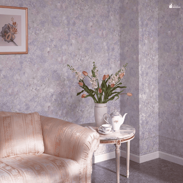
Flower prints include more than traditional bouquets. Their range of styles makes them easy to use in rooms with different looks.
For a minimalist room, try a simple line drawing of leaves or flowers. Black, cream, or muted earth tones can keep the look understated. In a midcentury room, choose graphic florals with bold shapes and defined blocks of color.
Contemporary interiors may work with macro photography or abstract interpretations that emphasize form rather than recognizable bouquets. Traditional spaces can support detailed botanical illustrations, still-life paintings and garden imagery with a more classical character.
Matching the artwork to the room does not mean reproducing every stylistic detail already present. In fact, some contrast is often useful because it prevents the interior from becoming overly coordinated.
A simple room can feel warmer with a painterly flower print. In an ornate room, a clean floral photograph may provide balance.
To make either choice feel at home, match the artwork to one detail in the room. That could be its color, size, or frame.
A black frame, for example, might connect a loose watercolor floral to black metal lighting elsewhere in the room. These small links allow the artwork to feel intentional even when its style introduces something new.
The period and mood of the floral imagery also matter. Vintage botanical plates often carry an academic quality that suits studies, libraries and traditionally furnished dining rooms. Loose watercolor flowers can feel informal and may work well in bedrooms or casual family spaces.
Highly saturated pop-art florals can introduce energy into apartments and contemporary living rooms without requiring equally bold furniture. Photographic flowers can shift from delicate to dramatic depending on lighting, crop and background.
Thinking about floral art as a broad visual language rather than a narrow decorative theme makes it easier to find an option that works with almost any established interior.
Creating a Stronger Focal Point With Minimal Change
Many rooms feel incomplete because they lack a clear focal point rather than because their furniture or finishes are inadequate. The eye enters the space but has no obvious destination, so the arrangement can seem flatter than it actually is.
Floral artwork can solve this problem by creating a concentrated area of detail, color and contrast. Placing a large print above a fireplace, sofa, bed or console establishes a visual hierarchy almost immediately.
Other furnishings begin to feel organized around that point even though their positions have not changed. This is one reason a relatively small decorative decision can alter the impression of an entire room.
The strongest focal points usually rely on contrast. A pale flower print may stand out against a dark wall, while a bold botanical image can provide needed intensity in a light neutral room. Contrast can also come from scale, particularly when one large artwork occupies a wall that previously held several undersized objects.
The subject itself can attract attention if the composition includes a dramatic crop, unusual perspective or strong directional movement. Flowers are useful in this respect because stems and petals naturally create lines that guide the eye across an image. The artwork therefore contributes both subject matter and visual structure.
Lighting can increase the effect without requiring major electrical work. A nearby floor lamp, picture light or well-positioned table lamp can draw attention to floral artwork during the evening when natural light disappears.
Daylight also changes the appearance of certain colors, so placement near windows should be considered carefully, particularly if glare affects glass-covered prints. A focal point should remain visible without dominating every viewing angle.
When artwork, lighting and furniture share a logical relationship, the room tends to feel more deliberate. That sense of intention can be mistaken for a far more extensive redesign than actually occurred.
Using Floral Art to Connect Existing Furniture and Accessories
One of the less obvious advantages of flower prints is their ability to connect objects that otherwise seem unrelated. A room may contain a blue chair, warm wooden table and cream-colored rug that function well individually but lack a common visual reference.
A floral artwork incorporating blue petals, green foliage and warm beige tones can create that connection without adding another large object. The print effectively gathers existing colors into one composition.
Once those colors appear together on the wall, the furniture can look more coordinated even though nothing has physically changed. This is a form of visual editing rather than conventional renovation.
The same principle applies to materials and textures. A botanical print with earthy greens and brown stems can reinforce wooden furniture, woven baskets and natural-fiber rugs. A crisp photographic flower printed on a sleek surface can relate more closely to polished metal, glass or contemporary lacquered finishes.
Frames can provide another layer of connection by echoing hardware, furniture legs or architectural trim. A black frame might reinforce dark window casings, while a pale oak frame can relate to Scandinavian-style furniture.
These details are small, but interiors often feel coherent because of repeated cues rather than large matching sets.
Accessories can then be adjusted selectively rather than replaced wholesale. A vase might repeat one secondary color from the artwork, while a cushion introduces another. Books, candles or ceramics can reinforce the palette in smaller doses, creating the impression that the room was assembled with greater intention.
There is no need for every accessory to reference the artwork directly because excessive matching can feel contrived. Two or three connections are usually enough to establish continuity. Floral art works particularly well as the starting point because its natural color variation offers several directions from which those connections can be made.
Keeping the Update Fresh Over Time
A room update should last beyond its first impression. Flower prints can keep a space feeling fresh as other details change.
Your furniture may stay in place while you swap smaller items with the seasons. Meanwhile, a floral print can tie the room together. One with warm and cool tones may suit light fabrics in spring and richer textiles in autumn.
The same image can therefore support several versions of the room without becoming irrelevant. This flexibility is particularly useful for people who enjoy changing accessories more frequently than furniture.
Rotating artwork can keep a room feeling fresh. If you own several pieces, swap those on display instead of buying new furnishings.
For example, hang a bright botanical print during warmer months. Later, replace it with a darker floral piece. You can also move artwork between rooms. Different wall colors and furnishings may bring out details you had not noticed before.
This approach treats wall art as an active part of the interior rather than as a permanent background object. It also allows a home to evolve without generating the waste associated with frequent replacement of larger items.
The broader lesson is that freshness in interior design often comes from changing what people notice first. A room does not necessarily need new floors, new furniture or a different wall color to create a different impression.
It may simply need a stronger focal point, a better color connection or an organic form to soften existing lines. Flower prints can provide all three while requiring relatively little physical or financial disruption.
Their range of styles means the effect can be subtle, dramatic, traditional or modern depending on the room. When selected with attention to scale, color and placement, floral artwork can make a familiar space feel newly considered without asking the rest of the room to start over.