What an Effective Warehouse Navigation Needs During Planning Process
This post may contain affiliate links which might earn us money. Please read my Disclosure and Privacy policies here
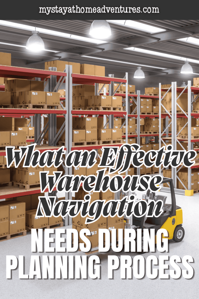
Most warehouse signage gets installed reactively. Something goes wrong, like a picker pulls from the wrong location or a forklift operator takes a turn that wasn't designed for forklift traffic. It can also be a new hire who spends forty minutes finding a bay that a ten-second sign would have located in ten seconds.
A laugh and a story that reaches the admin is only the time when someone puts up a sign to fix that specific problem.

Multiply that pattern across a year of operational friction, and the result is a facility covered in signage that addresses individual incidents. Even so, this does not form a coherent navigation system.
It's still a system where the visual language is inconsistent, and a person walking in for the first time has no reliable way to orient themselves using what's on the walls.
The planning conversation that should happen before any sign gets made rarely happens at all, and the facilities that do it well tend to have thought about navigation the way a building architect thinks about circulation, as a system problem that needs to be solved at the design stage rather than patched incrementally after the fact.
What the Facility Map Reveals Before Anything Gets Designed
The starting point for any warehouse navigation planning process is a current-state facility map that shows how people and equipment actually move through the space, not how the original layout intended them to.
Those two things diverge in most active facilities within months of opening as operational realities reshape traffic patterns in ways the original design didn't anticipate. High-traffic intersections that weren't designed as intersections.
Aisle configurations that made sense for the original inventory mix create bottlenecks for the current one. Receiving and shipping flows that cross each other at points where the original plan assumed they wouldn't.
A navigation system designed against the intended flow rather than the actual flow produces signs that point people toward paths they don't use and fails to address the decision points where they actually need guidance.
Walking the facility during peak operating hours and tracking where people pause, where they make wrong turns, and where they cluster waiting for each other to pass, identifies the real decision points that the signage system needs to serve.
That observation takes a few hours and changes the entire design brief in ways that a map review in a conference room doesn't.

How Visual Hierarchy Determines Whether the System Works at Speed
Warehouse navigation must work at speed. Employees moving through the facility do not have time to stop and read every sign. Instead, they rely on visual cues that quickly confirm they are in the correct zone, moving in the right direction, or approaching the correct bay.
For this reason, signage should focus on recognition rather than reading. Workers can recognize colors, symbols, and familiar layouts much faster than they can process text. If employees must read every sign, the navigation system slows them down.
A well-designed system supports productivity by making navigation quick, intuitive, and efficient.
Warehouse signage solutions that work at operational speed use visual hierarchy deliberately. Primary zone identification at a scale and height that's visible from the length of an aisle. Secondary aisle and bay identification at a scale readable from fifteen to twenty feet.
Tertiary location codes at close range for final confirmation. Each level of the hierarchy serves a different moment in the navigation sequence. The system works because each level is visually distinct enough from the others.
Hence, the eye knows which level it's reading without having to process the content first.
Color is an important part of a warehouse navigation system. Therefore, planners should establish the color scheme early in the design process rather than assigning colors as areas are labeled.
A consistent color scheme helps workers quickly identify different zones and functions. For example, a specific color can always represent the same type of area throughout the facility. Over time, workers learn these visual cues and respond to them automatically.
In contrast, randomly assigned colors create confusion. Workers must stop and read signs each time instead of relying on familiar visual patterns. As a result, navigation becomes slower and less efficient.
Where Safety and Navigation Overlap and Why That Matters for Planning
Forklift lanes, pedestrian walkways, and crossing points require both navigation and safety signage. At these locations, the two systems should work together rather than separately. Otherwise, conflicting visual cues can reduce clarity where it matters most.
For example, workers approaching a crossing point need clear directions and safety instructions at the same time. They must know where to go and when to stop before crossing.
If the signage systems use different visual styles, workers need extra time to interpret the information. As a result, response times can slow down at critical moments when quick and accurate decisions are essential.